Solid Glass: a glass theme for shadcn/ui built for AI apps (examples, Material UI comparison and Next.js setup)
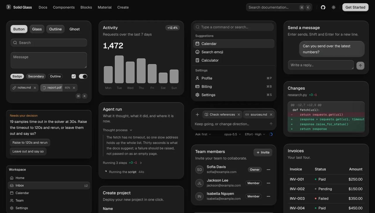
Solid Glass is an open source theme for shadcn/ui that turns every surface of your interface into a thick pane of smoky glass: opaque from a distance, with a rim of light, a hairline edge and a shadow up close. It is a single stylesheet, it leaves your components untouched, and it ships a dozen components of its own for AI agent interfaces. It is released under the MIT license.
We read the deeplethe/solid-glass repository (version 0.1.0, commit 6e8903e, October 16, 2026) and set it up in our own Next.js 16 project to show you what the components look like, compare them with shadcn/ui's default theme and with Material UI, and explain how to use it in Next.js, including the real build errors we hit. If you like free design tools, this topic also covers FigCraft, the open source Figma alternative.
What Solid Glass is
DeepLethe describes Solid Glass as "a design system for AI applications". In practice it is two things:
solid-glass.css: a 1,409-line file that redefines shadcn/ui's colour variables (--background,--card,--popover,--muted...) and adds the glass finish. Because it uses the same names, every shadcn/ui component you already have changes its look without editing a line.- Its own components for interfaces where an agent works: the turn status, the message box, the steps it ran, a diff, the question it asks, how full the context is, and more.
| Fact | Value |
|---|---|
| Repository | [github.com/deeplethe/solid-glass](https://github.com/deeplethe/solid-glass) |
| Site and docs | [deeplethe.github.io/solid-glass](https://deeplethe.github.io/solid-glass/) |
| Reviewed version | `0.1.0`, commit `6e8903e` (October 16, 2026) |
| License | MIT (the parts taken from shadcn/ui are MIT too) |
| Requirements | React 19, Tailwind CSS 4 and the Base UI flavour of shadcn/ui (`base-nova`) |
| What you install | One CSS file + the components you want, with the shadcn CLI |
| Themes | Dark (the original design) and light |
The idea: between flat design and liquid glass
The README explains it with a comparison that is easier to see than to read. Flat design is an opaque block: whatever is behind it makes no difference. Liquid glass (the nearly clear glass style that is everywhere now) lets all the background colour through, and on a text-heavy screen the reader fights the background for the words. Solid Glass only lets an outline through: enough to tell it is glass, not enough to get in the way of reading.
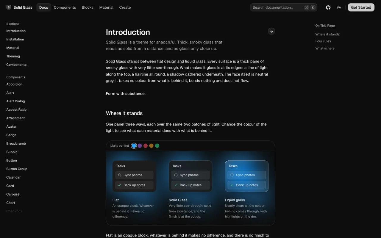
The whole system follows four rules documented at the top of the CSS file:
| Rule | What it means in code |
|---|---|
| The finish is at the edge | A rim of light on top (`--glass-rim`), a hairline (`--glass-edge`) and a shadow (`--glass-shade`). Never a gradient across the face. |
| Heavy, not airy | Neutral grey. The blur softens what is behind without boosting its colour. |
| Depth is thickness | Three thicknesses: `glass-panel` (thinnest) < `bg-card` < `bg-popover` (thickest and most opaque). |
| One state | Hovered, chosen and open-menu all wear the same small pane of clear glass (`glass-chosen`, `glass-held`). |
The clever technical detail is that the material hangs off the colour utilities themselves: any element with bg-card, bg-popover or bg-sidebar gets the blur, the rim and the shadow. That is why shadcn/ui components need no changes. The rules deliberately sit outside Tailwind's layers, so a utility written later cannot switch them off.
Examples: what the components look like
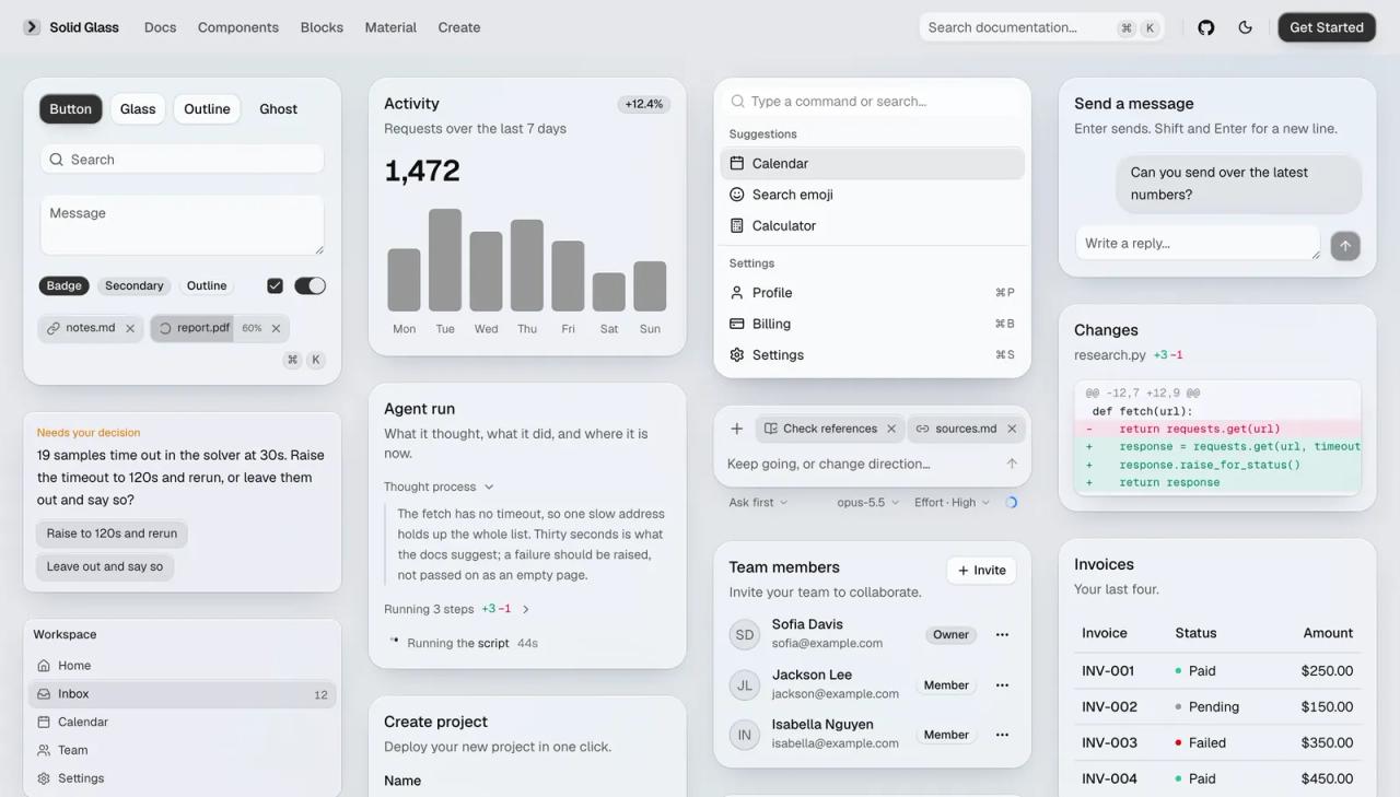
To avoid relying only on the official screenshots, we built a page from plain shadcn/ui components (Card, Tabs, Badge, Progress, Switch, Input and Button) and rendered it twice over the same background with two patches of colour: first with shadcn/ui's default neutral theme, then with solid-glass.css. The JSX is identical; only the stylesheet changes.
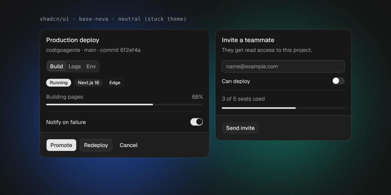
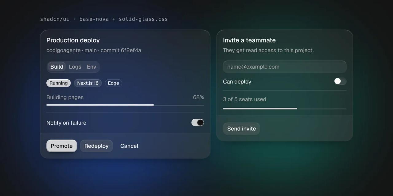
What changes, up close:
- Cards go from opaque grey to smoky glass. The blue and green behind tint the surface while text keeps its contrast.
- The primary button stops being a flat rectangle and becomes a solid pane with a rim of light on top and a shadow underneath.
- Fields and switches: the input is a pane of clear glass to type on; the switch track is cut like a groove, with the light falling the other way.
- Badges and tabs share the same rim-and-hairline language, without thick focus rings.
In light mode the same system uses white glass panes on a cool grey page:
The AI agent components
This is what sets it apart from any other theme. We rebuilt a conversation with an agent using only Solid Glass components: StepGroup (the steps it ran, with their diff), AskCard (a decision waiting for the user), TurnStatus (what it is doing right now, with time and tokens) and Composer with Tag and ContextRing (the message box with attachments, mode, effort and context usage).
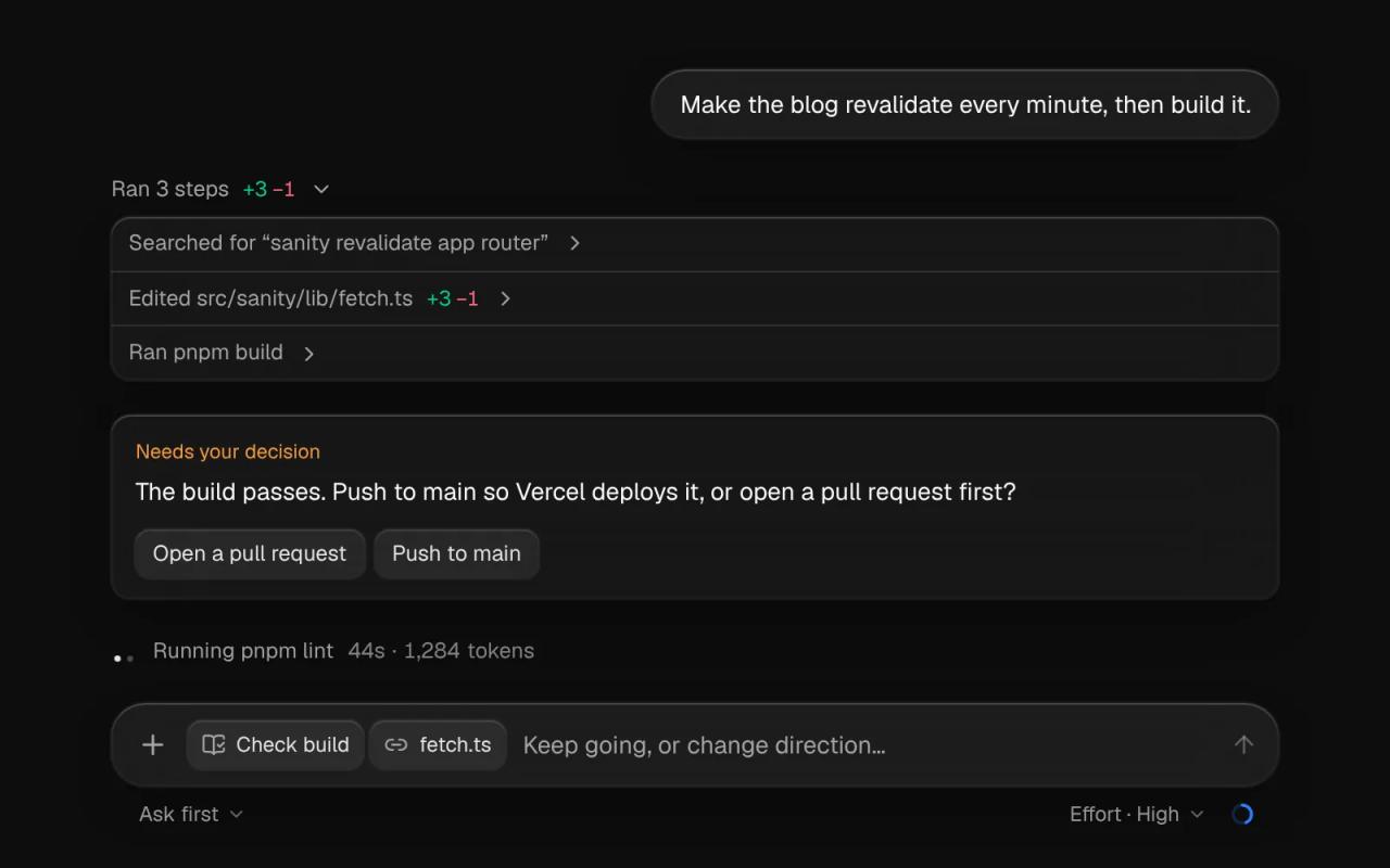
| Component | What it is for |
|---|---|
| `status-glyph` | Three points of light that say the turn is running and what it is doing (thinking, searching, running, writing). |
| `turn-status` | The agent's status line: activity, elapsed seconds and tokens. |
| `tool-steps` | The steps the agent took, collapsible, with output or a diff. |
| `diff-view` | A patch with added and removed lines coloured. |
| `ask-card` | A question from the agent with its options as buttons. |
| `composer` | The box you write in, with tags, pickers and a send button. |
| `context-ring` | A ring showing how full the context window is. |
| `task-notice`, `reasoning` | A notice from a background task and the model's reasoning. |
| `panel`, `tag`, `dot-loader` | The thinnest pane, a small label and a row of waiting dots. |
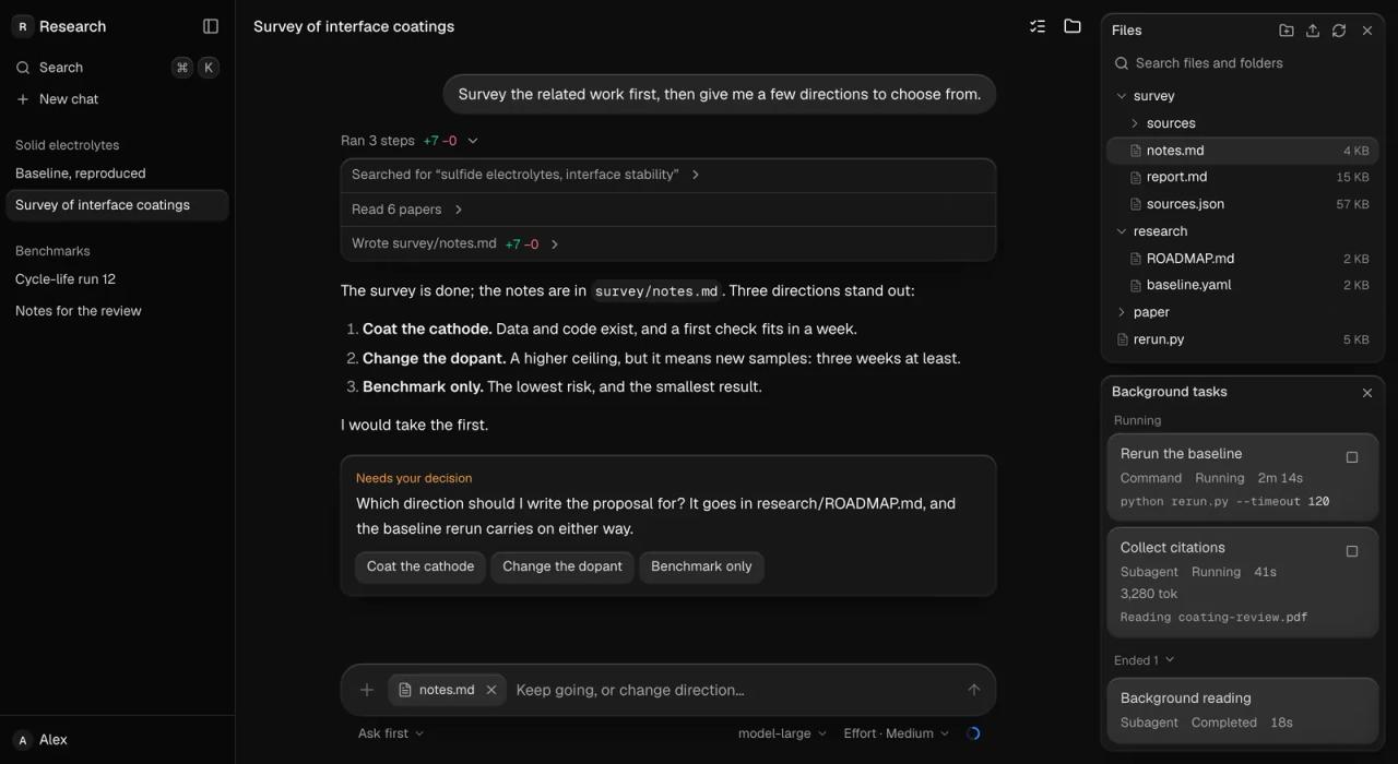
The project site also has a full block, an agent workspace with sessions, the thread, files and background tasks:
Solid Glass vs shadcn/ui vs Material UI
For the comparison we built the same screen a third time with Material UI 9.5 and its default dark theme, over the same background.
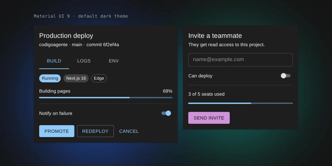
First, these are not three things of the same kind. shadcn/ui is a collection of components you copy into your project. Solid Glass is a theme (plus extra components) on top of shadcn/ui. Material UI is a full component library you install as a dependency, with its own styling engine.
| shadcn/ui (default theme) | Solid Glass | Material UI | |
|---|---|---|---|
| What it is | Components copied into your repo | CSS theme + AI components on top of shadcn/ui | Component library on npm |
| Look | Flat, neutral | Smoky glass, depth as thickness | Google's Material Design |
| Styling | Tailwind CSS + CSS variables | Tailwind CSS + CSS variables (one file) | Emotion (CSS-in-JS) |
| Customising | Edit the component code | Variables (`--brand`, `--radius`...) or edit the component | `createTheme()` and `sx` |
| In the Next.js App Router | Straightforward | Straightforward (see the caveats below) | Needs `@mui/material-nextjs` and client components |
| AI agent components | No | Yes (12) | No |
| Maturity | Widely used | Version 0.1.0 | Very mature |
| License | MIT | MIT | MIT (core) |
We also measured what the browser downloads for each version of our test page (production build, next start, compressed transfer size):
| Test page | JavaScript | CSS |
|---|---|---|
| shadcn/ui, default theme | 165 KB | 12 KB |
| shadcn/ui + Solid Glass | 165 KB | 18 KB |
| Material UI 9.5 | 211 KB | (inside the JS) |
Solid Glass adds no JavaScript: it costs about 6 KB of compressed CSS. The Material UI version downloads about 46 KB more JavaScript for the Emotion engine and the components themselves. These numbers come from a small page; in a large app the gap depends on how many components you use.
Which one should you pick?
- Material UI if you want a complete, proven system with advanced components (data grids, date pickers) and you are fine with the Material look and CSS-in-JS.
- shadcn/ui with its default theme if you want full control over the code and a neutral base you will design yourself.
- Solid Glass if you already use shadcn/ui (or will) and you are building a chat, a copilot or an agent dashboard: it saves you designing status, steps and decision components from scratch, and the look is distinctive without hurting readability.
How to use Solid Glass in Next.js
Solid Glass targets any React 19 project with Tailwind 4 (its own site is built with Vite), but it works in Next.js. We tested it in a project created with create-next-app 16.4.2. These are the steps.
1. Create the project and shadcn/ui with Base UI
Solid Glass builds on the Base UI flavour of shadcn/ui (the base-nova style), not the Radix one:
pnpm create next-app@latest my-app --ts --tailwind --app --src-dir
cd my-app
pnpm dlx shadcn@latest init --base base
2. Add the stylesheet
pnpm dlx shadcn@latest add deeplethe/solid-glass/solid-glassThe shadcn CLI reads the registry straight from the GitHub repository. To pin a version, add # and a commit: deeplethe/solid-glass/solid-glass#6e8903e.
3. Import it after Tailwind and delete the colour variables
In src/app/globals.css, import the file after Tailwind and shadcn's stylesheet, and delete the :root and .dark colour blocks that shadcn init wrote, because Solid Glass defines the same variables:
@import "tailwindcss";
@import "tw-animate-css";
@import "shadcn/tailwind.css";
@import "./solid-glass.css";
4. Turn on dark mode
Dark is the material as designed, and it follows the dark class on <html>. The simplest way:
<html lang="en" className="dark">If you use next-themes, set attribute="class" and defaultTheme="dark" on the ThemeProvider.
5. Fonts
The stylesheet sets --font-sans to "Geist Variable" and --font-mono to "Geist Mono Variable". If you load Geist with next/font, the variable it creates will not be used; the most direct option is the Fontsource packages:
pnpm add @fontsource-variable/geist @fontsource-variable/geist-mono@import "@fontsource-variable/geist";
@import "@fontsource-variable/geist-mono";6. Add the components you need
pnpm dlx shadcn@latest add button card
pnpm dlx shadcn@latest add deeplethe/solid-glass/ask-card deeplethe/solid-glass/turn-status
And use them like any shadcn/ui component:
"use client"

import { AskCard } from "@/components/ui/ask-card"

export function Decision() {
  return (
    <AskCard
      question="The build passes. Push to main or open a pull request?"
      options={["Open a pull request", "Push to main"]}
      onAnswer={(option) => console.log(option)}
    />
  )
}
For a bare pane with no component, use the material classes directly:
<div className="glass-panel rounded-md p-3">Panel</div>
<div className="rounded-xl bg-card p-4">Card</div>
<div className="rounded-lg bg-popover p-1">Popover</div>
Common errors in Next.js
Solid Glass's components are written for a project without React Server Components (its components.json has "rsc": false), and that shows in Next.js. These are the three things to watch; the second one actually broke our build:
1. Components with hooks inside a Server Component. status-glyph, turn-status, tool-steps, context-ring and composer use useState or useEffect and do not carry "use client" in the repository. Always import them from a file marked "use client" (like the example above), or add the directive at the top of the component.
2. TurnStatus breaks prerendering with Cache Components. create-next-app 16.4 enables cacheComponents: true in next.config.ts, and TurnStatus reads Date.now() when it mounts. The build fails with:
Error: Route "/agent": Next.js encountered the unstable value `Date.now()` in a Client Component.The fix is to wrap it in <Suspense> so it renders on the client:
import { Suspense } from "react"

<Suspense>
  <AgentPanel />
</Suspense>
3. Colours do not change, or they mix. Almost always the :root and .dark blocks written by shadcn init are still in globals.css, or solid-glass.css is imported before Tailwind. Order matters.
Does it work with Radix-based shadcn/ui?
Many projects (this blog included) use the new-york style, built on Radix. We tried solid-glass.css with our own Radix Card, Badge and Button:
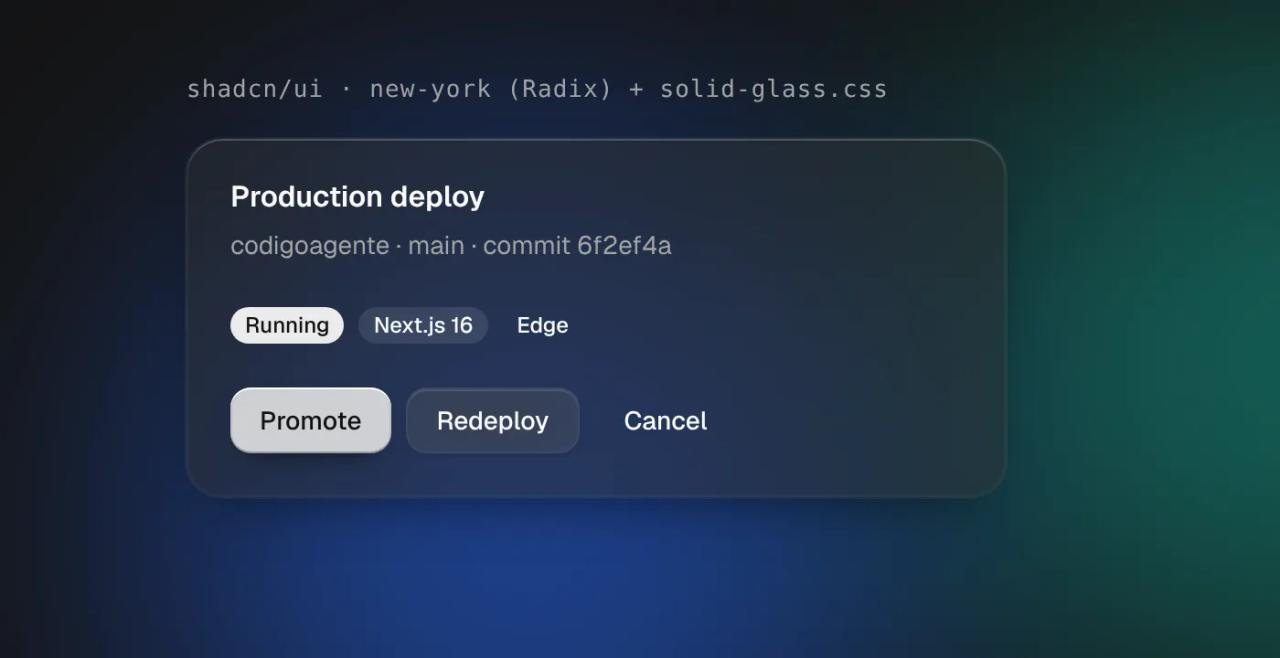
The card and the buttons take the material. The outline badge loses its border, because the stylesheet finds it by data-variant, an attribute Base UI components carry and the Radix ones do not. Several states are also matched by Base UI attributes (data-checked, data-popup-open) that Radix calls data-state="checked" or data-state="open", so switches, checkboxes and menus will not look the same. Bottom line: in a new project, start with Base UI; in a Radix project, test component by component before adopting it.
Solid Glass license
Solid Glass's code is under the MIT license (Copyright 2026 DeepLethe). The components, examples and docs that come from shadcn/ui belong to their authors, also under MIT, as NOTICE.md explains. Interaction comes from Base UI (MIT), icons from Lucide (ISC), and the Geist fonts are under the SIL Open Font License. You can use it in commercial projects as long as you keep the copyright notice.
What we checked
- We read
README.md,NOTICE.md,LICENSE, the docs incontent/and the 1,409 lines ofsrc/solid-glass.cssat commit6e8903e. - We created a project with
create-next-app16.4.2, copied the Base UI and Solid Glass components from the repository and compiled it withnext build. The screenshots marked "codigoagente" come from that project. - The shadcn CLI resolved the GitHub registry (
deeplethe/solid-glass/...), but we could not completeshadcn addfrom our environment because it blocksui.shadcn.com, where the CLI downloads the base palette. On your machine it works with a normal connection. - We could not open the project site from our environment; the official screenshots come from the repository itself.
Frequently asked questions
Is Solid Glass a component library? Not exactly. It is a theme for shadcn/ui (one CSS file) plus 12 components of its own for AI interfaces. The base components are still shadcn/ui's.
Do I have to rewrite my shadcn/ui components? No, if you use the Base UI flavour. The stylesheet finds each part by its data-slot and classes. With the Radix flavour it works partly.
Does it work with Next.js? Yes. We tested it with Next.js 16.4.2 and the App Router. Mind "use client" on components with hooks and <Suspense> around TurnStatus if you use Cache Components.
Is there a light mode? Yes. Dark is the original design; light uses white glass panes and turns on when you remove the dark class.
Can I change the brand colour? Yes: set --brand, --brand-foreground and --brand-muted in both :root and .dark. Every corner radius is derived from --radius.
Is it better than Material UI? It depends on the project. Material UI is more complete and mature; Solid Glass is lighter, adds no JavaScript and ships agent-specific components, but it is at version 0.1.0.
Can I use it for free in a commercial project? Yes, the MIT license allows it.
Conclusion
Solid Glass is the fastest way we have seen to give a shadcn/ui app a look of its own without touching the components: one CSS file, zero extra JavaScript and a coherent visual language. Its agent components are the most valuable part if you are building a chat or a copilot. If your project is Next.js, start with shadcn/ui on Base UI, follow the six steps above and check the two build caveats before you deploy.
// source code
// implementation
More on Open source tools
- Free alternatives to paid apps
- Run it on your server
- Design, image and video
- Free alternatives to paid apps
- Free alternatives to paid apps
- Design, image and video